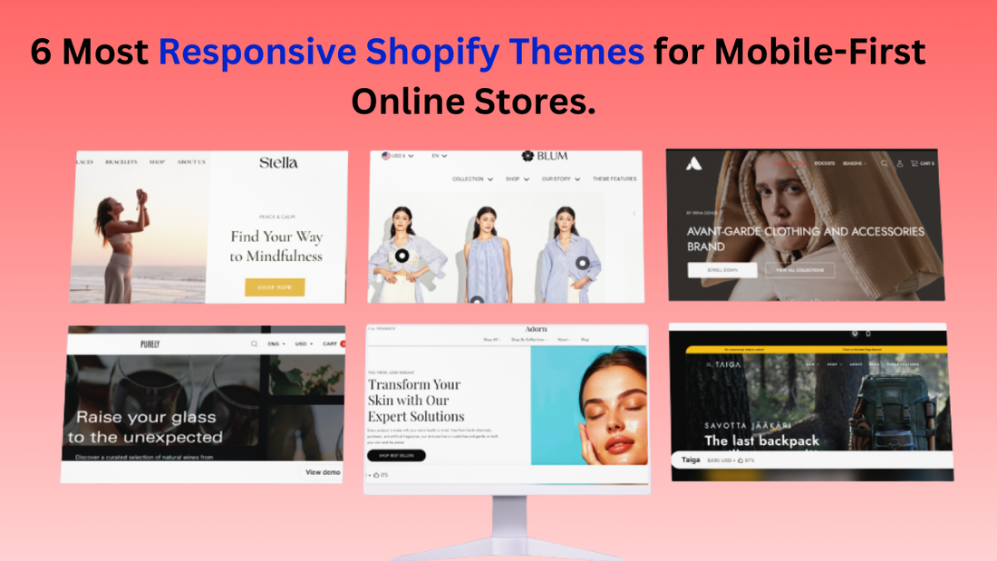
6 Most Responsive Shopify Themes for Mobile-First Online Stores
With most online shoppers now using smartphones to browse and purchase, adopting a mobile-first approach is no longer optional; it’s essential for e-commerce success. A mobile-first design ensures that your store’s navigation, content, and core functionality are optimized for smaller screens first, before adapting to larger devices like tablets and desktops. This approach delivers faster loading speeds, a clean interface, and an intuitive shopping experience tailored to today’s on-the-go consumers.
Just as premium WordPress templates are built to provide flexibility and responsiveness, Shopify also offers themes that excel in mobile optimization. In this article, we’ll highlight the 6 most responsive Shopify themes designed for smooth browsing, quick load times, and user-friendly navigation across every device. Whether you’re starting a new store or refreshing an existing one, these themes will help you deliver a shopping experience that aligns with the expectations of mobile-first customers.
What Makes a Shopify Theme Mobile-First?
A mobile-first Shopify theme isn’t just about shrinking a desktop design to fit smaller screens; it’s about designing with mobile users as the priority. Since the majority of online shoppers browse and buy directly from their phones, a theme needs to deliver speed, simplicity, and usability on every mobile device. Here are the key factors that make a Shopify theme truly mobile-first:
-
Superior Speed and Performance
Mobile users are notoriously impatient. A delay of even a few seconds can cause a significant drop-off in sales. A mobile-first theme is built from the ground up to be lightweight and fast, prioritising minimalist code, optimised assets, and efficient frameworks.
-
Intuitive and Thumb-Friendly
Mobile-first design accounts for the fact that users navigate with their thumbs. This means the theme's layout is clean, simple, and easy to use with one hand.
-
Focus on Content and Visual Hierarchy
On a small screen, every pixel counts. A mobile-first theme prioritises essential content and uses visual cues to guide the user's eye. The theme is designed to make a big impact with product photos and lifestyle imagery, allowing them to fill the screen and create a more immersive experience.
-
Seamless Mobile-Checkout Experience
Cart abandonment is a major issue in e-commerce, and a clunky mobile checkout process is a leading cause. A mobile-first theme simplifies the purchasing journey by minimising steps, integrating payment options, and making cart and checkout buttons sticky.
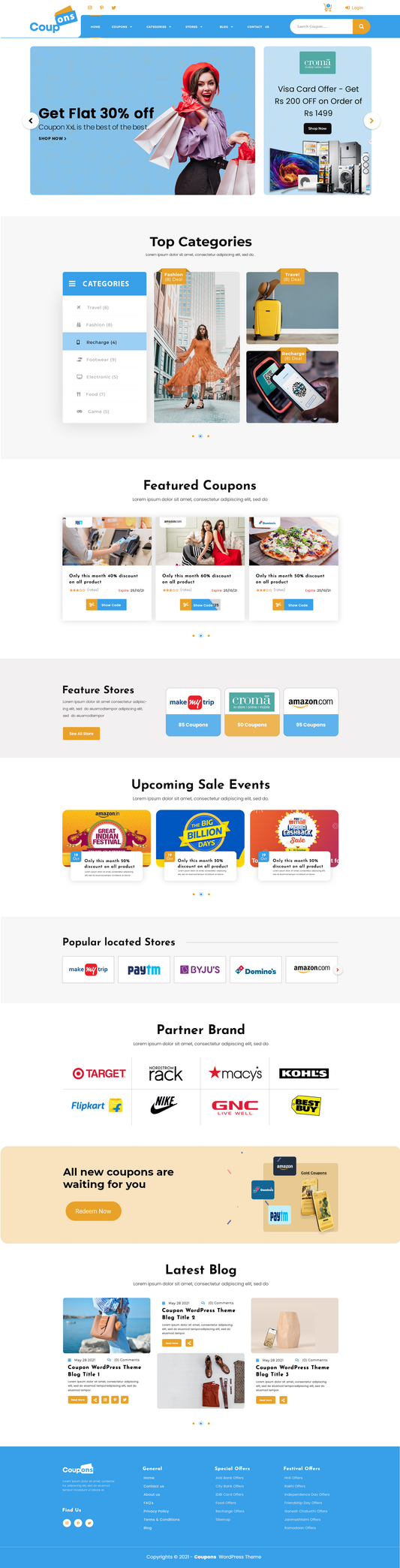
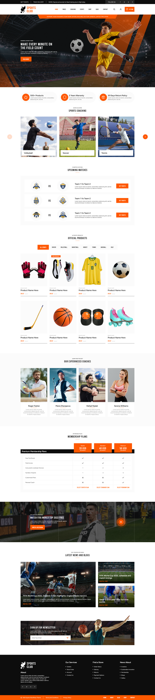
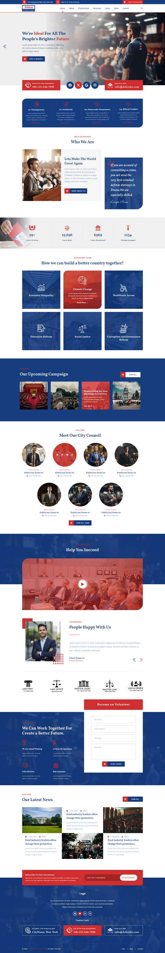
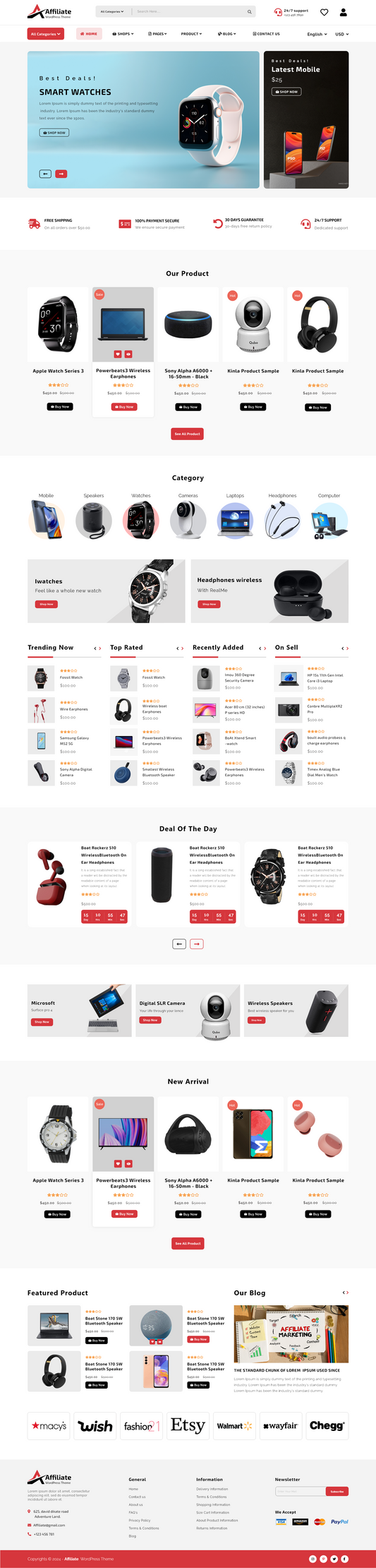
Listing out the Best Responsive Shopify Themes
Here’s a curated showcase of top responsive Shopify themes, complete with mobile previews to spark inspiration!
Adorn

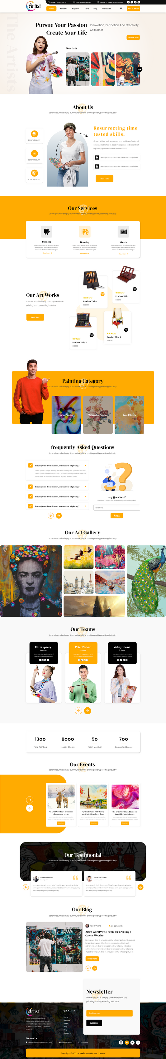
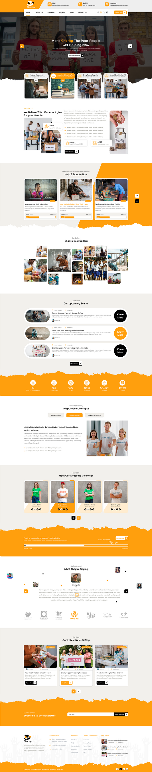
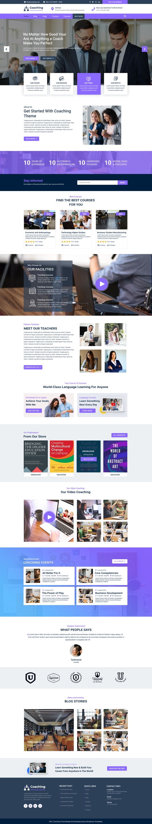
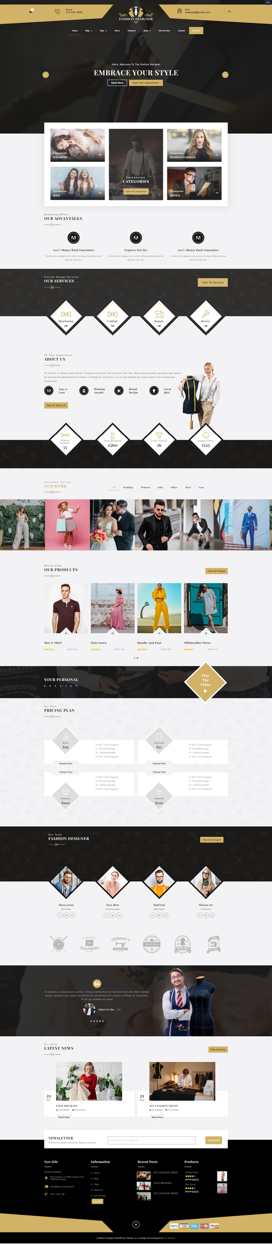
The Adorn Shopify theme is a premium theme specifically designed for the beauty, skincare, wellness, and cosmetics industries. It stands out in the best Responsive Shopify themes category because it's not just mobile-friendly; it's a mobile-first theme built to showcase visually-driven products with sophistication and a focus on conversion.
The theme's core design is tailored for beauty brands that rely on high-quality imagery to sell products. It features elegant layouts, curated colour palettes, and refined typography that create a cohesive and luxurious brand image. This visual emphasis translates perfectly to mobile screens, where product photos are crucial. Adorn is optimised for a fast and seamless mobile shopping experience. It's built with clean, lightweight code that facilitates quick page loading, which is crucial for reducing bounce rates and enhancing SEO on mobile devices. The design is "thumb-friendly," with clear, tap-able buttons and a layout that's easy to navigate on a small screen. Adorn comes with a variety of built-in features that are designed to turn mobile visitors into paying customers. Overall, the VW Adorn Shopify theme is an excellent choice for any business in the beauty or wellness space that wants to create a sophisticated, high-performing online store. Its deliberate focus on mobile-first design, combined with its conversion-centric features, makes it a top contender for brands that want to capitalise on the growing trend of mobile commerce.
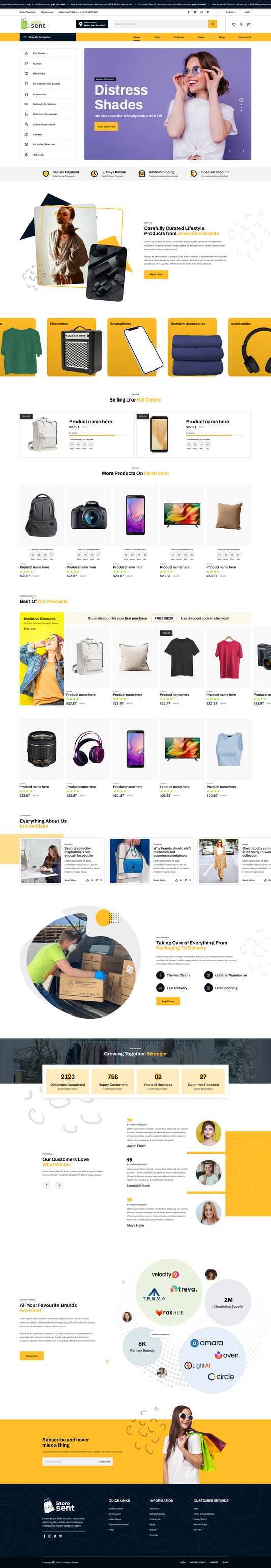
Choice Preset

The Choice Preset of the Adorn theme is built for brands that want sophistication blended with usability. It offers a clean, elegant design that highlights fashion items, accessories, and lifestyle products without overwhelming the shopper. Its intuitive layouts allow customers to focus on product details, while the preset’s responsive design ensures a flawless browsing experience on desktops, tablets, and smartphones. The Choice Preset also supports visual storytelling, making it easy to showcase lookbooks, seasonal campaigns, or curated collections. Perfect for fashion retailers looking to balance luxury with functionality, Choice helps create a storefront that feels both premium and approachable.
Closet Preset

The Closet Preset is designed for modern fashion brands that thrive on energy and visual impact. Unlike minimal themes, Closet embraces bold layouts and dynamic styling that resonate with younger and trend-conscious audiences. It’s ideal for clothing lines, streetwear brands, and lifestyle retailers who frequently launch new collections. With features like dynamic lookbooks, swipe-friendly browsing, and more than 30 customizable sections, Closet offers unmatched flexibility to present products in a visually engaging way. This preset gives fashion stores the ability to stay fresh, vibrant, and in line with the fast-moving world of fashion trends.
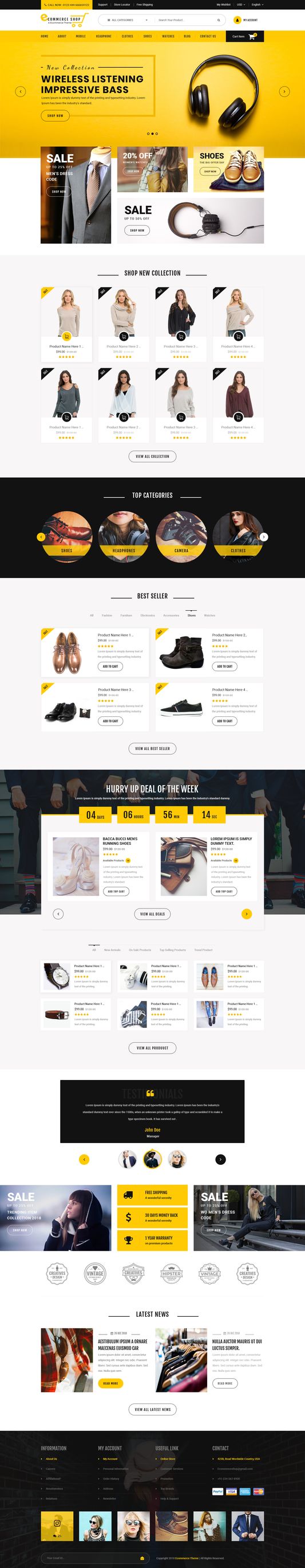
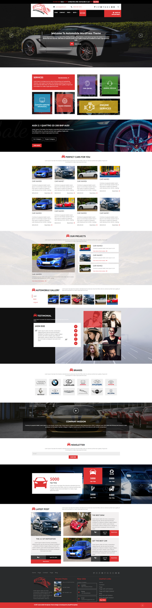
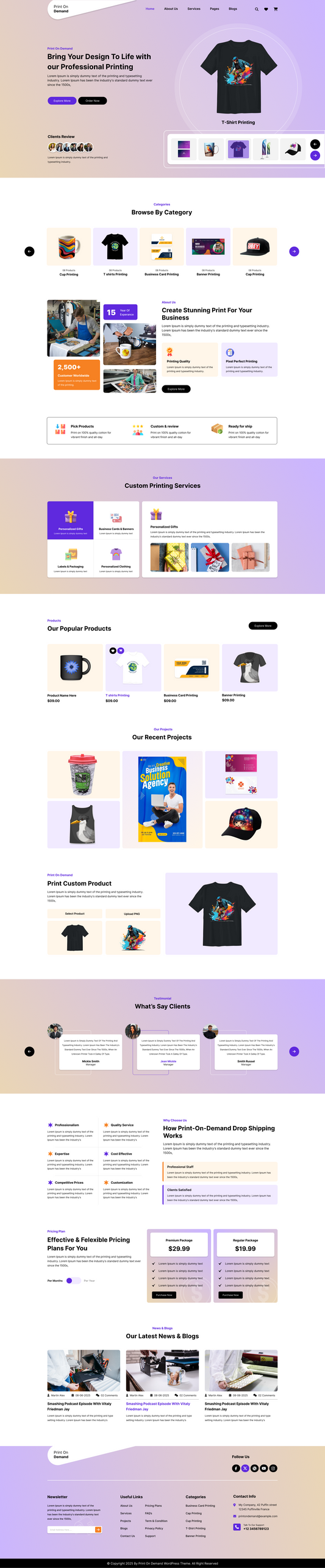
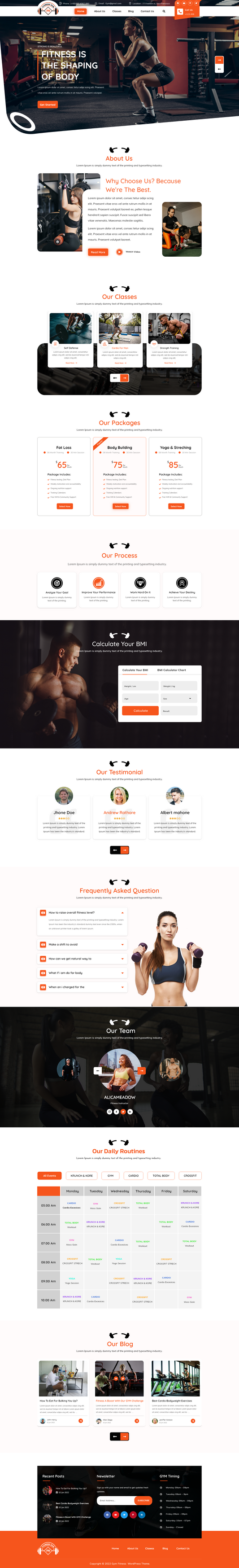
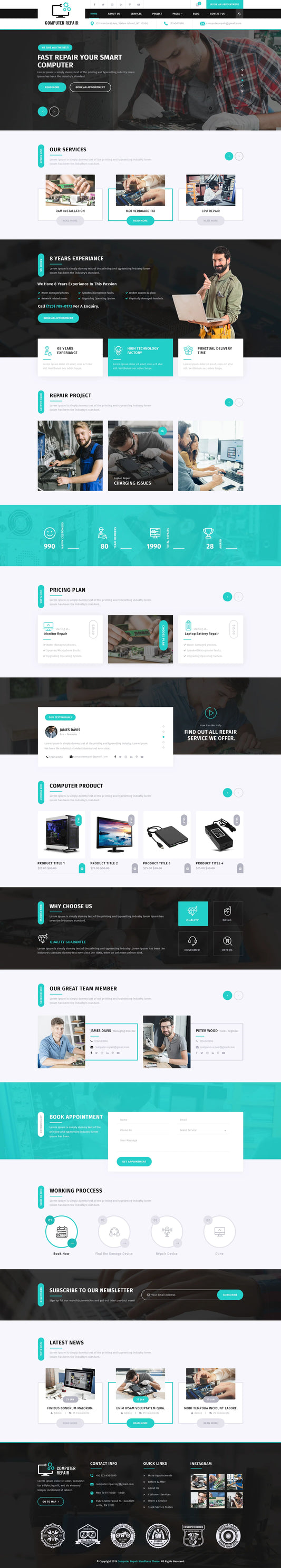
Purely

Purely Shopify Theme truly stands out as one of the Best Responsive Shopify Themes. It is a premium and responsive WordPress template designed to be highly optimised for conversions. It's particularly well-suited for online stores in specific niches, such as wine, coffee, watches, and jewellery.
Purely is built with a focus on maximising sales. It includes a range of features designed to drive conversions, such as cross-selling, upselling, quick buy options, and product sliders. The theme is built to be mobile-first and optimised for speed, ensuring a fast and seamless shopping experience for customers on any device, including desktops, tablets, and smartphones. It offers a wide range of customisation options, allowing merchants to easily tweak layouts, colours, and fonts to match their brand identity without needing to write code. The theme helps customers find what they're looking for with features like enhanced search, breadcrumbs, swatch filters for product variants, and "recently viewed" sections. Purely has generally received positive reviews from users, with many highlighting the theme's elegant design, useful features, and strong customer support.
Avante

The most captivating Responsive Shopify Theme is here to build your store more crowded with users. This Avante Shopify theme is a premium, responsive theme designed to create a luxurious and visually captivating online store. It's particularly well-suited for fashion, beauty, and accessories brands, as it focuses on high-end user experience and aesthetics.
Avante is crafted to impress customers with its clean, elegant user interface and engaging user experience. It leverages captivating visuals to showcase products and highlight brand identity, while offering exceptional flexibility. With over 40 customizable sections, merchants can create unique page layouts without touching a single line of code. Multiple layout templates, sidebar options, and typography presets make it easy to match any brand’s style.
Built for brands that thrive on rich imagery and videos, Avante includes features like slideshows, image hotspots, and interactive “before/after” sliders perfect for telling a compelling product story. To boost conversions, it comes packed with sales-driven tools such as promotional pop-ups, countdown timers, trust badges, and intuitive navigation for stores with large catalogs.
Equally important, Avante is optimized for speed and responsiveness across all devices, ensuring a seamless shopping experience and stronger SEO performance. Just like implementing an XML sitemap in SEO helps search engines crawl and index your site efficiently, Avante’s Online Store 2.0 architecture, built with native Liquid and JS ensures optimal site structure, performance, and visibility.
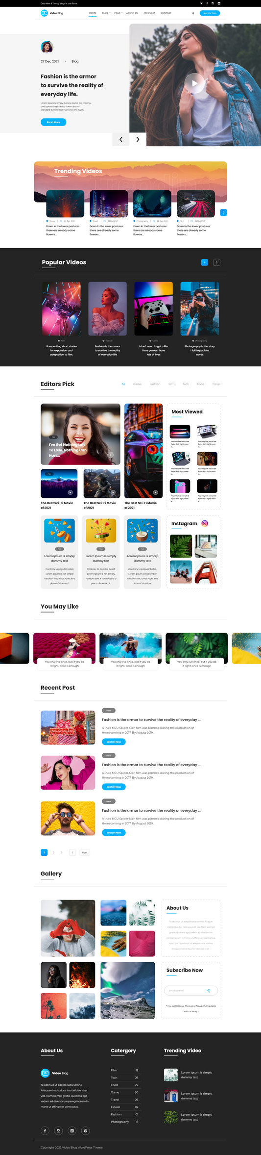
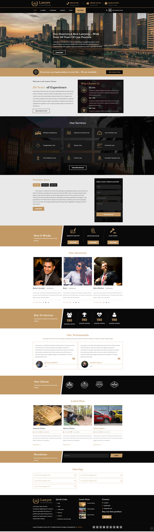
Taiga

Among the best Responsive Shopify Themes, we have picked another skilled theme for you. The Taiga Shopify theme is a premium, best responsive wordpress theme known for its focus on speed and visual storytelling through extensive use of video and imagery. It's built for merchants who want to create a sleek, modern, and high-performing online store.
Taiga is designed with a modern codebase that prioritises speed and efficiency, giving it a winning edge in store performance. This is crucial for both user experience and search engine optimisation. What sets Taiga apart is its heavy emphasis on visual content. It includes over 10 different video sections, allowing you to create a dynamic and immersive shopping experience. This is ideal for brands that want to showcase their products in action or tell a compelling brand story. Built on the Shopify Online Store 2.0 architecture, Taiga offers extensive customisation options with over 20 drag-and-drop sections. The theme is equipped with a wide range of marketing and merchandising features to boost sales. Taiga helps customers find products efficiently with features like enhanced search with autocomplete, infinite scroll, and swatch filters for product variants. Overall, Taiga is an excellent choice for businesses that want to create a visually-driven brand. It's well-suited for industries like fashion, beauty, home goods, and accessories, where high-quality images and videos are key to marketing and conversions.
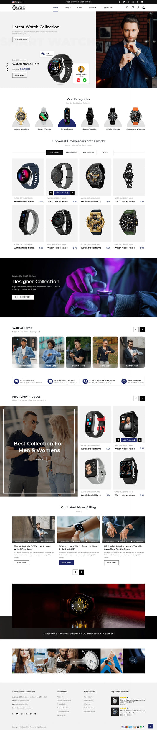
Blum

With the urge to find the best Responsive Shopify Themes, we have got you another flexing option. The Blum Shopify theme is a premium, responsive theme designed with a strong focus on speed and mobile-first design. It's particularly popular for fashion, beauty, and lifestyle brands that rely on high-quality visuals to tell their brand story.
Blum is engineered for performance, especially on mobile devices. User reviews and testing results frequently highlight its fast loading speeds, which are a critical factor for a positive user experience and search engine optimisation. The theme is built to be visually captivating. It offers a variety of customizable, content-rich sections and layouts that are ideal for showcasing products through high-resolution images and videos. Built on the Shopify Online Store 2.0 architecture, Blum offers extensive drag-and-drop customisation. It comes with several pre-designed styles (presets) like "Solie" and "Mondo" that cater to different brand aesthetics, from youthful and playful to minimalist and sophisticated. For a seamless shopping experience, Blum provides features such as an advanced mega menu, enhanced search with autocomplete, and swatch filters for product variants, which are especially useful for stores with large product catalogues.
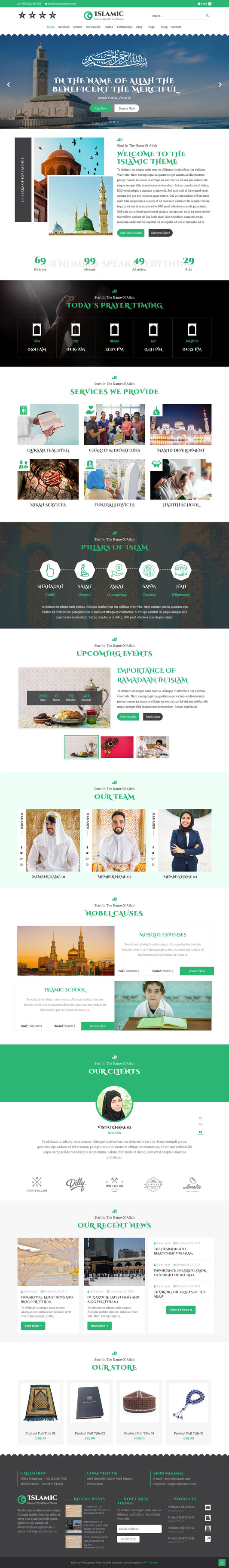
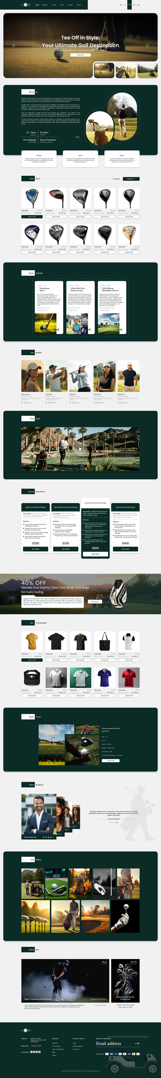
Stella

One of the most captivating and Responsive Shopify Themes is here to help you build mobile-first stores. This Stella Shopify Theme is what we are talking about. It is a paid, responsive theme that is part of the larger Aurora theme family. It's specifically designed to create an elegant and immersive online store, making it a great fit for brands in the jewellery, beauty, and wellness sectors. The theme's core strengths lie in its visual storytelling capabilities and conversion-focused features, all built on the modern Shopify Online Store 2.0 architecture.
Stella is optimised to showcase products through rich visual content. It includes features like slideshows, a variety of video sections, and "lookbooks" to help you create a compelling and editorial-style shopping experience. The design is clean and delicate, allowing your products to be the main focus. The theme is built with a strong emphasis on driving sales. As a Shopify Online Store 2.0 theme, Stella offers extensive customisation with 35+ flexible sections. This allows you to easily arrange and design your store's layout without needing to write any code. The theme also supports different product page layouts and a variety of content blocks for detailed product information. Stella is designed to be fast and responsive across all devices. Getsitecontrol is also highly praised for its excellent customer support, with many reviews highlighting their responsiveness and helpfulness in resolving issues.
Conclusion
Selecting the right Shopify theme plays a vital role in delivering a seamless mobile-first shopping experience. The “most responsive Shopify themes” today go beyond simply adjusting to different screen sizes; they focus on providing a complete, high-performance, and conversion-optimized experience that’s visually appealing and easy to manage. The themes we’ve highlighted set a new benchmark for e-commerce by combining speed, aesthetics, functionality, and reliable support elements that are essential for thriving in a mobile-first marketplace.
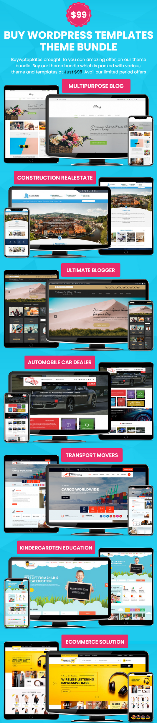
Ultimately, your choice should align with your brand’s unique needs, whether it’s Adorn for beauty, Avante for luxury, or Blum for its conversion-driven features. No matter which one you pick, each provides a strong foundation for online success. Similarly, if you’re looking for a comprehensive solution to design multiple sites with flexibility and efficiency, a WP theme bundle can give you access to a range of professional designs and tools in one package.